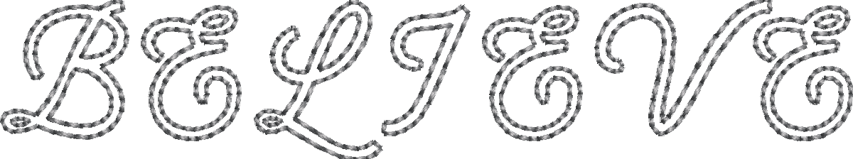
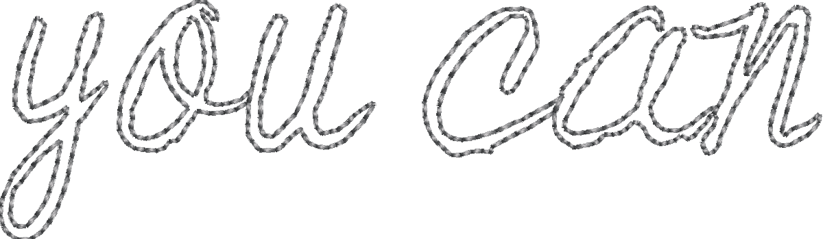
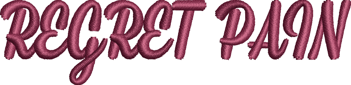
Cursive fonts are beautiful, no doubt about it. They’ve got that hand-drawn, personal vibe that feels luxe without trying too hard. But when it comes to custom embroidery? That’s where things can get a little messy.
Not all cursive fonts are made for thread. Some look amazing on screen but fall apart when stitched – too thin, too tight, too loopy. You might end up with letters that blur together, stitches that break, or worse… a design that just doesn’t read clean. And if you’re running a brand, whether you’re selling caps, jackets, or artisan aprons, bad embroidery isn’t just frustrating. It’s bad business.
But here’s the good news – you don’t need to guess which fonts will hold up in embroidery. We’ve done the legwork.
And listen—we’re not going to throw 40 font names at you and call it a “guide.” You’re getting just 11 of the best, organized by stitch type, chosen for how they actually perform in real-world custom embroidery. These fonts have been tested, tortured, tweaked, and proven to stitch like a dream.
Whether you’re creating custom embroidery on hoodies, hats, bags, or tees, this is the cheat sheet that’ll keep your designs looking sharp. No guesswork. No wasted samples. Just fonts that work.
✂️ Need help with artwork prep?
Before you upload, make sure you’re not sending in a low-res mess. Check out this step-by-step help file on prepping your artwork like a pro.
Let’s break it down into stitch type by stitch type.
Stitch Type Basics – What You’re Really Working With
Before we toss font names at you like a Pinterest board exploded, let’s pause for a hot second. You’ve gotta know how the stitches work because stitch type is the invisible engine behind every clean, crisp, or catastrophically awful embroidered letter.
Need a deeper dive? Don’t worry, we’ve stitched together a no-nonsense guide to understanding embroidery stitch types so you’re not flying blind.
And here’s your crash course, minus the fluff:
Running Stitch (a.k.a. the minimalist) | Satin Stitch (a.k.a. the show-off) | Tatami Stitch (a.k.a. the heavyweight champ) |
|---|---|---|
| 🧶This is your clean line, single-thread-style stitch. It looks like someone drew your text with a fine pen. Perfect for small designs, outlines, and lightweight fabrics. 🧶Pros: Fast, efficient, low thread usage. 🧶Watch out: Not great for complex or thick fonts. It’ll choke. 🧶Think of it like writing with a gel pen – smooth, but don’t try bold calligraphy with it. | 🧶This one’s the embroidery equivalent of a silk ribbon. Satin stitches lay down threads side by side to form thick, shiny columns. They pop – literally and visually. 🧶Pros: Looks super polished and high-end. Great for logos and bold cursive. 🧶Watch out: Too-thin fonts will break up or fray. Too thick? May pucker fabric. 🧶Pro tip? Satin stitch is your go-to when you want that premium look without overcomplicating the digitizing process. | 🧶Tatami is a tightly packed, zigzag-meets-weave technique. It fills large areas with texture and is ideal for bigger cursive designs where you need some visual weight. 🧶Pros: Great coverage. Sturdy. Works beautifully on jackets, hoodies, and heavy gear. 🧶Watch out: Detail gets lost fast in small sizes. Don’t go micro with this beast. 🧶Tatami stitch is like painting with thread – bold strokes, rich feel, high impact. But you need the right kind of font to match the muscle. |
Now that you’re no longer flying blind, let’s break down the fonts, starting with the ones that know how to keep it simple, aka the Running Stitch MVPs.
Best Fonts for Running Stitch – Clean, Simple, and Slick
Running stitch is the quiet genius of embroidery. Not loud. Not flashy. But when done right? Chef’s kiss. It’s the minimalist’s dream. A single-line hero that thrives on simplicity and precision.
Perfect for tiny tags, discreet branding, or small logos where space is tight but style still matters. But here’s the kicker: running stitch doesn’t play well with overly ornate or delicate fonts. You throw in too many loops or ultra-thin strokes, and it all goes sideways.
Here are the best cursive picks that hold their shape, without looking like a tangled thread mess:
1. Rochester
Rochester brings retro signature energy – classic, confident, and just detailed enough to feel high-end. It’s got that old-school vibe without feeling dusty.
Why it works:
- Traditional cursive structure that’s easy to digitize
- Minimal variation in thickness
- Open loops keep stitching smooth and clear
✨Best For: Vintage-inspired logos, gentleman’s fashion, nostalgic brand aesthetics.
2. Sacramento
Neat, stylish, and a little understated. Sacramento gives you that effortless handwriting look with none of the over-the-top frills.
Why it works:
- Monoline simplicity = zero stitch clutter
- Wide spacing keeps each letter distinct
- Small loops make it legible even at low sizes
✨Best For: Delicate branding, women-led labels, subtle embroidery tags.
3. Quarter (monoline script)
Quarter keeps it modern and minimal. It’s geometric, balanced, and super easy to read, which makes it a total win for running stitch.
Why it works:
- Clean monoline structure = flawless translation to thread
- No sharp twists or overly complex joins
- Maintains form even in tight embroidery spots
✨Best For: Urban fashion, startup branding, or sleek, no-fuss merch.
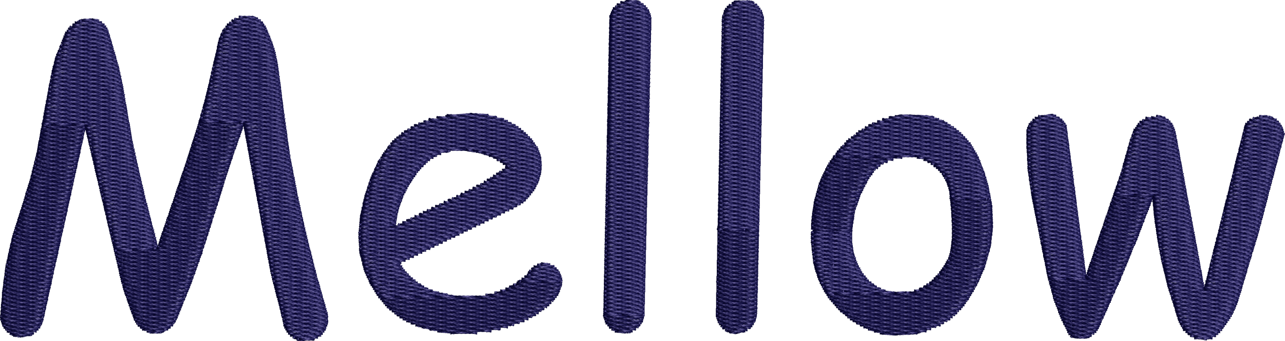
4. Leonaley (Monoline script)
Leonaley is that soft-spoken stunner. It’s gentle, elegant, and perfect for brands that want a handcrafted feel without getting overly ornate.
Why it works:
- Even curves and zero-thick-thin contrast
- Balanced rhythm across each word
- Connects beautifully without overcomplicating the stitch path
✨Best For: Handmade brands, artisanal goods, or elevated eco-conscious merch.
5. Homemade Apple
This font feels like a handwritten grocery list but make it fashion. It’s quirky, chill, and just messy enough to look real (without falling apart in thread form).
Why it works:
- Loose, legible flow = easy for running stitch to follow
- Slightly irregular curves look intentional when stitched
- Doesn’t try too hard – just vibes
✨Best For: Lifestyle accessories, handmade-style branding, or that “cool cousin who knits and has a brand” aesthetic.
Best Fonts for Satin Stitch – Smooth Operators Only
Alright, let’s talk satin stitch. This one’s the smooth operator of the embroidery world, the kind that gives your lettering a clean, raised finish with just enough shine to make people do a double-take. You’ve probably seen it on premium hoodies, left-chest logos, or that one perfectly-stitched hat you wish you could replicate.
The trick with satin stitch is choosing the right kind of cursive. Too thin? It disappears. Too thick? You end up with a weird thread blob. So you want fonts that are steady, have good stroke weight, clear shapes, and enough space between the letters to let the needle do its thing.
Here are the fonts that pass the vibe check and the thread test:
6. Lucida Handwriting
Think: laid-back elegance. Lucida Handwriting has a handwritten charm but with enough structure to stitch smoothly. It’s approachable yet polished.
Why it works:
- Medium weight that fills nicely without overkill
- Consistent curves = easy satin stitching
- Looks personal, but still professional
✨Best For: Lifestyle brands, spa/grooming labels, signature-styled logos.
7. Sofia
Sofia is soft, modern, and full of personality. It’s got that perfectly balanced monoline flow with a bit of sass, and satin stitch brings out every detail beautifully.
Why it works:
- Consistent stroke width makes it ideal for satin
- Open letterforms = minimal distortion
- Subtle flair without complexity
✨Best For: Trendy fashion labels, kid-friendly branding, or minimalist merch with character.
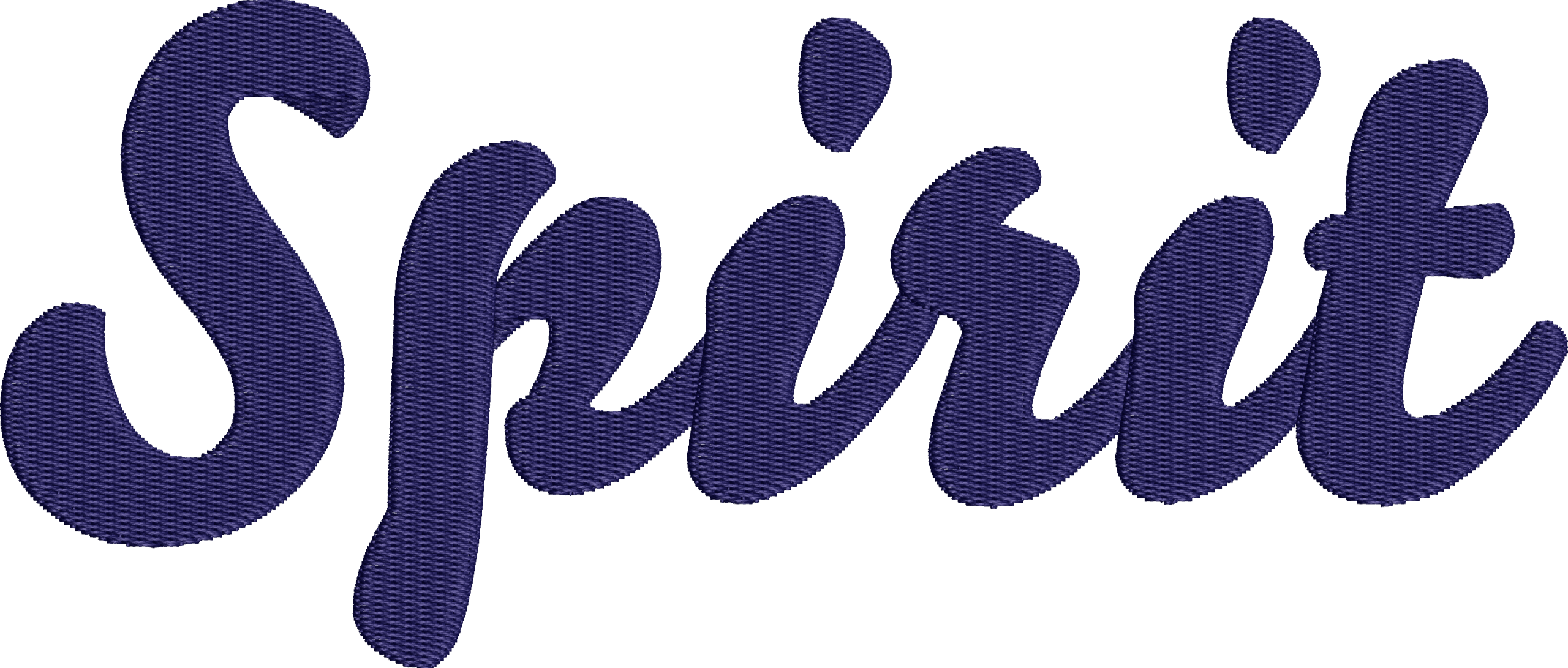
8. Mission Script
Mission Script is a smooth talker. It’s elegant without being stiff and works beautifully in satin stitch thanks to its graceful curves and confident structure.
Why it works:
- Balanced slant and weight = clean satin transitions
- Well-spaced letters reduce thread bunching
- Chic, modern vibe that reads high-end
✨Best For: High-fashion branding, boutique apparel, or upscale wellness brands.
Best Fonts for Tatami Stitch – Thick, Textured, and Built Like a Tank
Go big or go home.
Here’s the truth no one tells you in your typical embroidery tutorial: Tatami stitch isn’t for your tiny script tags or chest logos. Tatami stitch – also known as a fill stitch – is your embroidery’s heavyweight champ, designed to handle large areas, complex shapes, and bold designs where other stitches tap out. You need something with thick lines, wide spacing, and enough surface area to let that thread lay down like a boss. If you pick a font that’s too dainty? It’ll either sink into the fabric or get swallowed whole by the fill pattern.
“Use satin stitch for the small stuff, anything under 7mm. It’s clean and sharp, but can’t handle wide areas. If your script design spans more than 7mm, you’re out of satin territory. When your design gets up to 7 inches, it’s time to switch to Tatami stitch. It’s built for coverage, stays tight, and holds up over time.”
– Your favorite embroidery nerds at [Apliiq]
Below are a few heavy-hitters that won’t crumble under pressure:
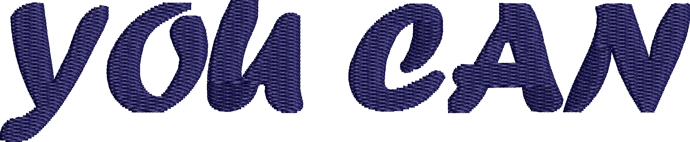
9. Comic Sans MS
Yeah, we said it. Comic Sans gets a lot of hate – but at large sizes with Tatami fill? It holds its own. Chunky, clear, and surprisingly smooth when stitched big.
Why it works:
- Thick letterforms = ideal for fill
- No tight curls or extreme contrast
- Bold enough to carry visual weight
✨Best For: Youthful brands, playful product lines, or limited-edition streetwear drops with irony baked in.
10. Bello Script Pro
Bello is lush, contemporary, and full of character. If your design calls for drama and it’s big enough – this font paired with Tatami can make it pop.
Why it works:
- Full-bodied script that’s fill-friendly
- Rounded curves make for smooth stitch angles
- Works well for upscale, bold branding
✨Best For: Premium outerwear, boutique interiors, or luxe lifestyle merch with presence.
11. Forte Regular
This one is a little vintage, a little cheeky. Forte has just enough flair to feel expressive, but it’s sturdy enough for Tatami when the size is right.
Why it works:
- Large x-height and simple forms = easier fill
- Less contrast in strokes = fewer stitch issues
- High readability in embroidery
✨Best For: Retro-inspired fashion, indie merch drops, or playful text-based designs.
Embroidery is equal parts art and engineering, and when it comes to cursive fonts, the right choice can make or break your design. This guide cuts through the noise to bring you 11 of the best cursive fonts that aren’t just stylish on screen, but built to perform in the thread. Whether you’re working with clean and minimal running stitches, polished and premium satin fills, or bold, textured tatami blocks, each font we covered was selected for its stitchability, legibility, and brand-ready appeal.
From laid-back fonts like Leonaley and Homemade Apple to bold showstoppers like Forte, you now have a go-to list that skips the guesswork and saves you time, money, and fabric. So the next time you’re staring down a blank embroidery file, remember: good design starts with smart font choices. And now? You’ve got the ultimate shortcut.
Thread wisely ✨