St. Paddy’s Day has a funny way of sneaking up on brands. One minute it’s business as usual, the next minute everything is green, inboxes are louder, and someone on your team says, “Should we do something for this?”
That question alone has launched a lot of unnecessary merch.
St. Paddy’s Day is not a merch strategy. It’s a timing window. Brands get this wrong when they treat the holiday like a theme they need to design around. You don’t. You just need to know what to highlight, what to avoid, and when to get out of the way.
☘️ Here’s how to do that in ways that actually translate to sales –
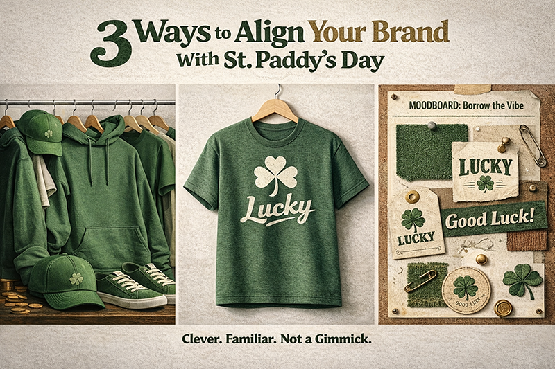
1. Feature All-Green Products (Start With What Already Sells)
St. Paddy’s Day doesn’t ask for new silhouettes, new fits, or experimental blanks. It asks one simple question: Do you already have green products that sell?
If the answer is yes, congratulations – you’re most of the way there. The smart play is to push what already works and let the holiday do the heavy lifting. Instead of building something new, take your best-performing tees and put them front and center with a green-first narrative. St. Paddy’s Day rewards brands that already have green in their lineup and know how to frame it. This isn’t about creating holiday merch. It’s about timing existing products correctly.
That’s why staples carry this moment so well:
- Gildan Unisex Heavy Cotton™ T-Shirt (5000) – In Antique Irish Green, this tee is boring in the best way. It’s familiar, dependable, and built for volume – exactly what you want when demand spikes.
- Bella+Canvas Jersey Tee (3001) – Kelly Green brings a cleaner, more fashion-forward feel. This is a strong option for brands that care about fit and softness but still want a color that pops during the holiday window.
- Next Level Apparel Cotton T-Shirt (3600) – Kelly Green does the visual work for you. Bold, modern, and clean – perfect for brands that lean contemporary without needing loud graphics.
🍀We went all-in on green last year – covering different green products and accessories that brands actually sell around St. Patrick’s Day. If you’re building a broader green collection, it’s worth revisiting.
2. Use artwork or imagery to symbolize luck
Luck is the easiest idea to use for St. Paddy’s Day. It’s also easy to ruin. Most brands add too much. Too many graphics. Too many ideas. The shirt starts to feel like a joke. People wear it once. Then it stays in the closet. A better way to think about luck is as an idea, not a theme. As Tennessee Williams said, “Luck is believing you’re lucky.” That’s a useful filter when you’re designing. You don’t need to explain the holiday. You just need the design to make sense on its own.
St. Paddy’s Day already has symbols people understand. You don’t need to spell everything out. One symbol. One message. That’s enough.
The key question to ask yourself: How does my brand feel about luck? Use this to riff off ideas and go from there.
A good test: If the shirt feels weird to wear on March 18, it’s doing too much.
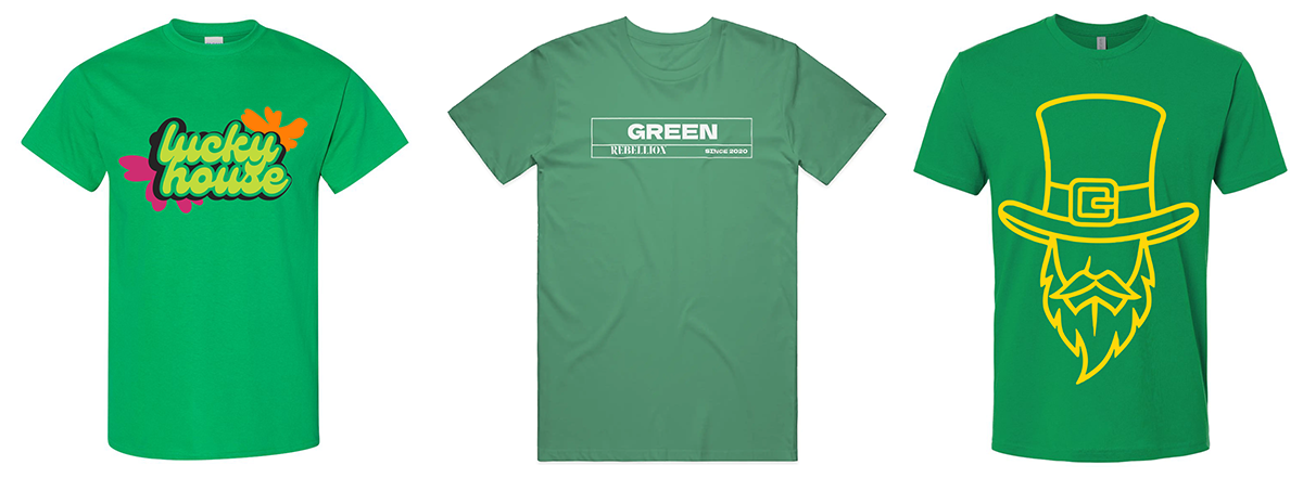
Symbols that work well on tees
These are easy to print and easy to wear after the holiday:
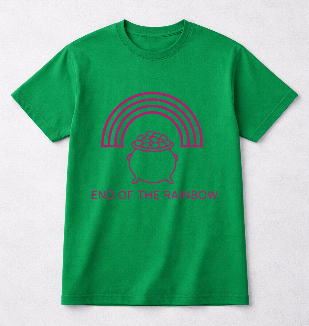
- Four-leaf clovers – good luck
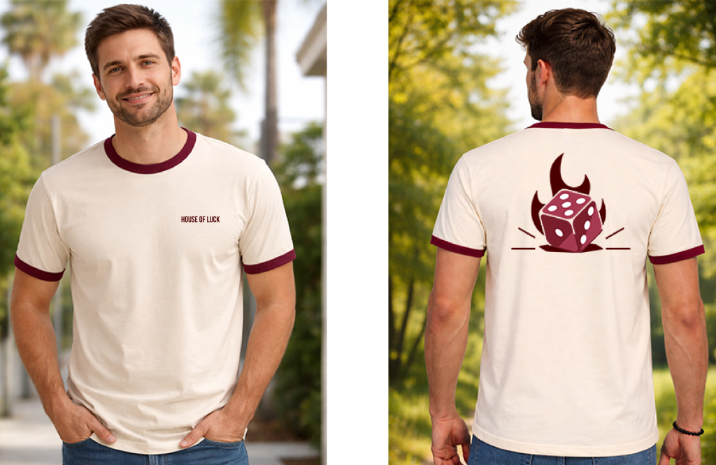
- Dice – taking chances
- Repeating numbers like 4444 or 8888
- Horseshoes – protection
- Acorns – growth over time
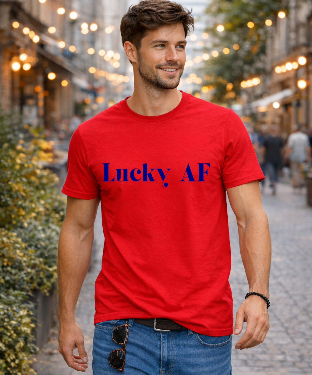
- “Luck of the Irish” in clean text
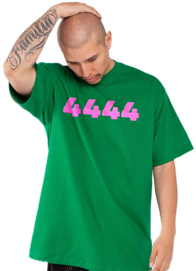
Keep it simple
- Small designs
- Few colors
- One idea per shirt
3. Borrow from an existing Brand around luck
You don’t need to invent a new idea for luck. Some brands already did that work years ago. The trick is not copying, but borrowing the vibe people already recognize and flipping it so it feels like your brand. Think familiar. Then twist it.
I. Lucky Brand
Lucky Brand is all about easy confidence. Nothing loud. Nothing forced.
How to use this:
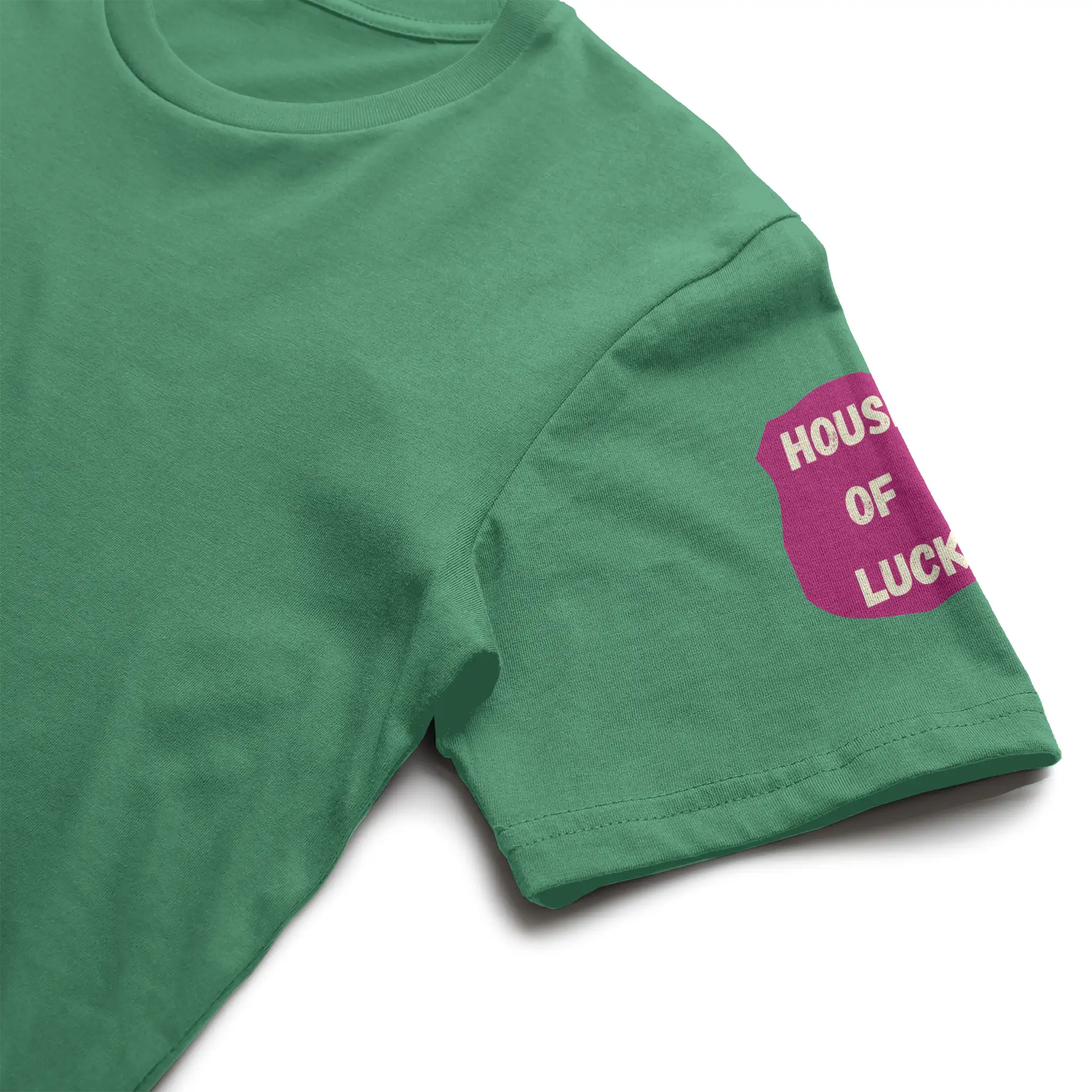
- Simple wordmarks
- Vintage-style type that feels worn-in
- Small chest prints or left-pocket placements
- Washed greens, faded black, sand, or off-white blanks
Think: a tee that just says “Lucky” and lets the blank do the work. If it feels like something you’d find at a thrift store and keep forever, you’re on the right track.
II. Lucky Charms
This one is playful, but dangerous if you go too far.
Don’t do:
- Cartoon overload
- Bright rainbow chaos
- Literal cereal boxes on tees
Do this instead:
- One charm at a time (clover, horseshoe, star)
- Flat, simple icons
- Muted or vintage colors
- Clean layouts with lots of breathing room
III. Lucky Strike (and bowling alleys)
Lucky Strike works because it feels bold and old-school and dangerous.
You can pull from:
- Round logo-style designs (like badges or signs)
- Graphics that look stamped or pressed, not detailed
- Red or cream ink on green shirts
- Short phrases like “Lucky Break” or “Strike Lucky.”
Bowling energy helps here, too. Think retro. Think worn-in. Think graphic tees that feel collected, not launched for a holiday.
The rule for all three
People should recognize the reference in one second. They should never feel like they’re wearing a parody. If it feels clever and a little familiar, you nailed it. If it feels loud or obvious, pull it back. Luck sells best when it looks like it wasn’t trying too hard.
How Brand Owners Should Actually Think About St. Paddy’s Day
St. Paddy’s Day isn’t a theme. It’s a moment. Use it to:
- Resurface products that already perform
- Tell a tighter story around color and symbolism (Answer the question: “What does luck mean for your brand?”
- Test lucky concepts without committing to inventory
That’s why it pairs so well with print-on-demand. You can move fast, stay flexible, and avoid overproducing merch that only makes sense once a year. If you approach the holiday this way, you’re not making St. Paddy’s Day apparel. You’re making good apparel that happens to align with St. Paddy’s Day. That’s the difference, and your customers can tell.
And yes, wearing green still helps!!💚