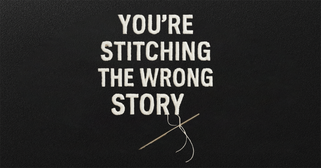
You know what’s worse than picking the wrong font for custom embroidery?
Thinking you nailed it – until your order shows up looking like your logo had a meltdown mid-stitch.
Harsh? Maybe. But real.
Embroidery is not Photoshop. It’s not Canva, it’s not your MacBook screen where everything looks flawless and high-res. This is thread, fabric, tension, and needlework. You’re asking a machine to punch thousands of tiny holes through material—and expecting it to turn out smooth, clean, and elegant. It’s precision meets pressure, and there’s no undo button.
💡Spoiler alert: It won’t, unless you play by embroidery’s weird little rulebook.
And guess what – most people don’t.
Why? Because nobody tells you the truth.
You’re choosing fonts that look good, not ones that actually stitch well.
This is where issues tend to arise.
Embroidery isn’t just about design – it’s about physics. Fonts with excessive loops or tightly spaced letters often don’t translate well. The machine struggles, leading to distorted stitching, overlapping letters, or text that appears shaky and uneven.
And that leads to…
- Misshaped text
- Gaps in the design
- Stitches pulling or puckering
- Illegible branding 😩
Not exactly what you want when you’re charging $50 for a premium hoodie.
The root problem? Nobody tells you the rules.
You’re supposed to somehow know that certain fonts need satin stitches instead of running stitches. And that anything smaller than 0.2 inches tall will stitch out looking like a faint shadow of itself
But that changes now. This blog’s here to pull back the curtain- so your embroidery doesn’t just look good, it looks pro.
So this guide? It’s here to save your stitches.
Let’s get into those sneaky mistakes to dodge. Ready?
🧵Mistake #1: Choosing Fonts Based on Aesthetics Alone
We get it—some cursive fonts are absolutely stunning. But not every digital beauty can survive the realities of embroidery.
🧠“Just because a font looks amazing on your screen doesn’t mean it’ll survive the embroidery machine.”
—Every digitizer, ever.
Delicate swirls? Overlapping loops? That fancy ‘L’ with three crossbars? They might scream luxury on your screen, but try stitching them on a hoodie and you’ll end up with a messy knot of thread that’s lost all trust.
🧵Mistake #2: Skipping the Stitch Test
Would you launch an entire collection without checking a sample first? Exactly.
Every fabric tells its own story – whether it’s fleece, cotton, or nylon. And fonts? They react differently depending on stitch type and size.
So, before you dive headfirst into ordering 100 embroidered hoodies, take the time to run a test stitch. It’s a small step that can save you money, materials, and a lot of headaches down the road.
🧷Mistake #3: Thinking Size Doesn’t Matter (It Really, Really Does)
Let’s say it loud and clear: tiny fonts are not your friend.
Even if they look adorable in your design file, embroidery has a harsh reality.
What appears delicate, elegant, and graceful on your screen can quickly become a tangled mess of thread once it hits the hoop.
Embroidery isn’t like printing. It’s not about vectors or pixels – it’s about thread. Thread that pulls, bunches, and has its own weight. And most importantly, it needs space to breathe.
Rule of thumb:
👉 If your font is under 0.5″ in height, proceed with serious caution.
👉 Under 0.25″? Honestly, don’t. That’s asking for heartbreak.
Some fonts just aren’t built to scale down. Others are champs at smaller sizes—if you choose the right stitch (yep, it’s all connected).
Embroidery tip from the pros:
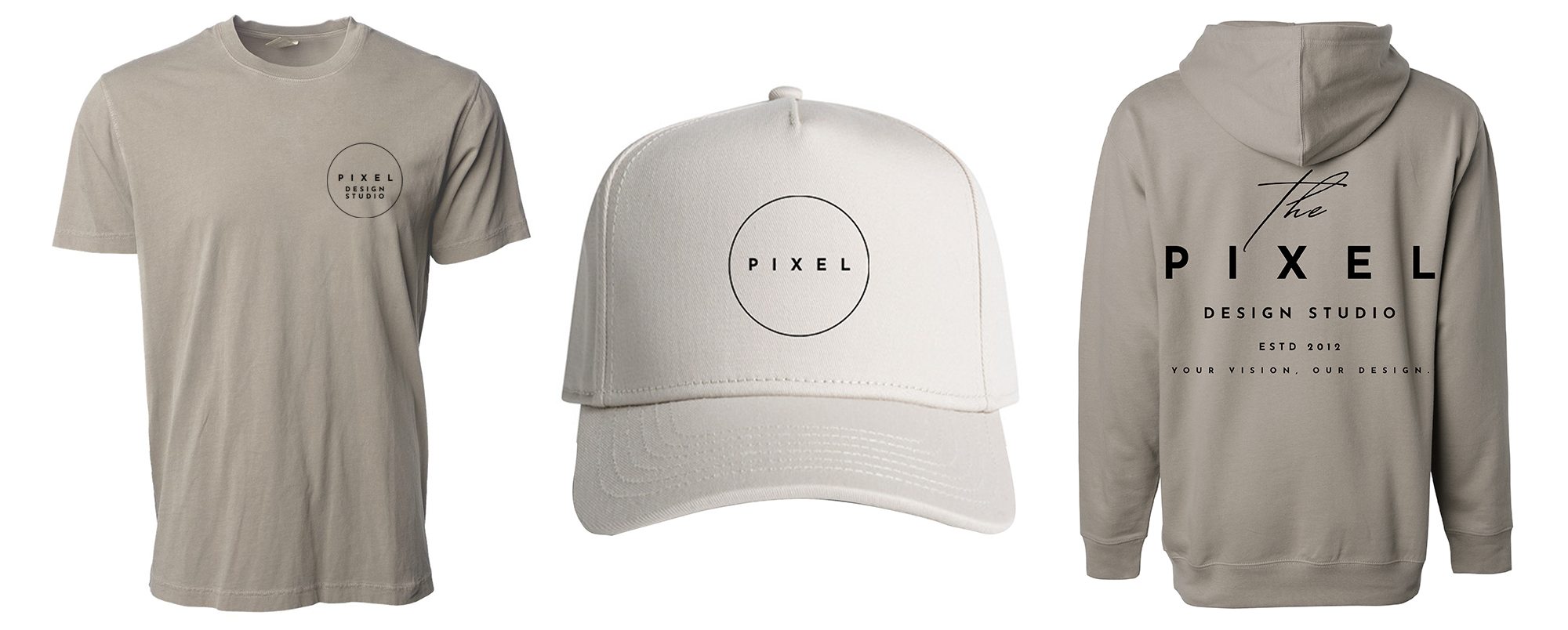
Major brands design different logo versions tailored for each item—one for hats, one for t-shirts, and another for hoodies. It’s not excessive; it’s a strategic move.
🧷Mistake #4: Not Talking to an Embroidery Expert (We Got You)
This is a big one. Many new brand owners treat embroidery like digital printing – set it and forget it. But the thread has texture, tension, and density that demand attention.
If you’re ever unsure or want to make sure your design will turn out just right, don’t hesitate to reach out.
Don’t guess—just ask us!
Have questions about sizing, stitch types, or whether that stunning font will work on fleece?
🎯Reach out to our team at Apliiq—we’re here to help!
Quote to Remember:
“Embroidery is where art meets engineering. The wrong font can make the right design fall flat.”
— Apliiq’s Creative Team