Let’s be real, if you’re in the U.S., soccer (yeah, I said it 😅) hasn’t always been the sport. But somehow, every time the FIFA World Cup rolls around, the entire country tunes in. Most people look at FIFA merch and just see jerseys, tees, maybe a hoodie or two.
But if you’re in the apparel space, if you’ve ever built a product, obsessed over labels, or tried to make something people actually care about, you start seeing it differently. Because this isn’t just merch. This is one of the few cases where a logo, a color, or a jersey can carry global emotion and still sell at scale without feeling watered down. Billions of people, in different countries, with different cultures, and somehow it all lands. That’s rare.
And for a platform like Apliiq, where we’re constantly thinking about how brands show up on garments, how labels build trust, how small details turn into big identity, it’s worth breaking down something that’s clearly working on a massive level. That’s exactly why I wanted to break down FIFA merch.
Let’s Take a Step Back
Before we get into this, I wanted to walk you through a quick breakdown of some FIFA pieces and call out a few details you might not notice at first glance. It’s a solid watch if you’re into how products are actually built and not just how they look.
Now, let’s get into it.
This isn’t about selling FIFA merch. I’m not here to hype it up or tear it down for no reason. This is more like… sitting on the sidelines, watching how the pros run their plays.
Think of it like armchair quarterbacking, but for apparel.
If we were a fly on the wall in their merchandising meetings, what would we see? What decisions are they making? What are they prioritizing? What are they getting right… and where do they kind of fumble? Whether you like it or not, FIFA is one of those brands almost everyone recognizes. And yeah, if you’re building something in apparel, it’s worth studying brands like that. Not to copy them, but to understand the thinking.
So that’s the lens here. We’re just watching the game, calling the plays, and breaking down what’s actually working.
Breaking Down the Hat
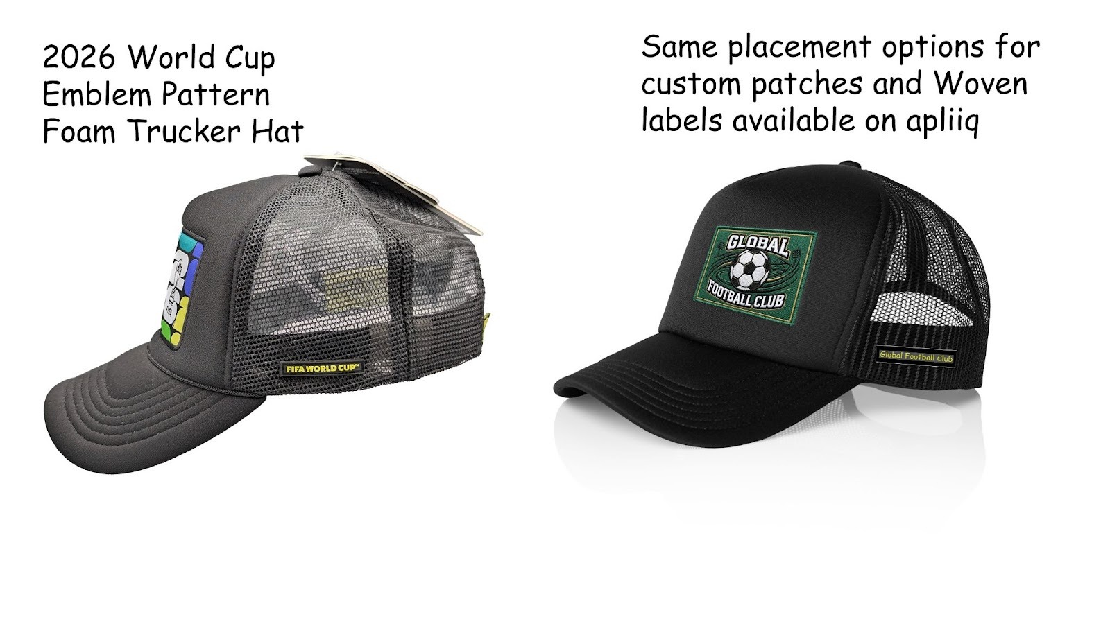
Alright, first up, we’ve got the trucker hat. And right away, this feels like a safe but smart play. It’s a classic silhouette – structured front, mesh back, curved brim. Nothing new here. This is something almost anyone can wear, and that’s exactly the point. They’re not trying to reinvent the hat; they’re trying to make sure it works for everyone.
Now the real action is on that front patch.
That bold, colorful graphic with the World Cup trophy? That’s doing all the heavy lifting. It’s loud enough to grab attention, but it’s not tied to a specific team or country. So instead of limiting who can wear it, they’ve opened it up to everyone who just wants to be part of the FIFA World Cup energy.
That’s a smart move. And here’s something I really like: they’re not relying on direct embroidery or basic prints here. They’re using patches. That instantly elevates the product. It gives it more dimension, more presence. You can feel the difference. There’s also that small side detail ( a silicone patch), subtle branding, nothing loud. But it finishes the product. It makes it feel complete. This is one of those plays where nothing is flashy, but everything is doing its job.
If I had to pull a few real takeaways from this, it would be:
- Keep it simple, but make sure one element really stands out
- Make something people can wear anytime, not just for a specific moment
- Don’t underestimate small details, they add more than you think
- And tie your product to a bigger feeling or moment, not just a design
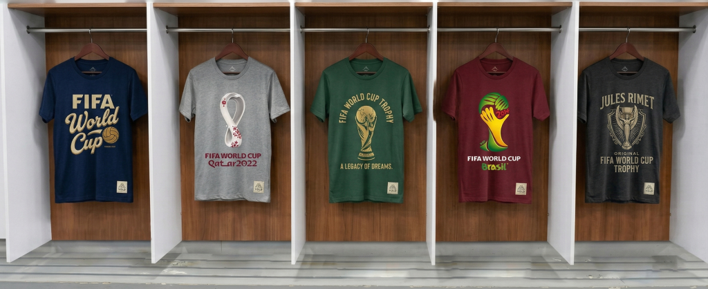
Next Up: The T-Shirt
Alright, shifting gears, let’s move to the t-shirt.
Now this is where brands usually either overdo it or completely miss the mark. But here, FIFA keeps it right in the middle. The design is clean. Not trying too hard. Not overloaded with graphics. Just enough to connect back to the FIFA World Cup without making it feel like you can only wear it during the event.
And that’s key, this is something you can throw on any day. But here’s the detail that really stands out, the woven label on the lower right hem.
That small flat woven tag? That’s how you know it’s part of their “Classics” collection. And the fact that it’s always placed in the same spot, that consistency builds recognition over time. You don’t even need to think about it. You just start associating that detail with the collection.
That’s how real branding works. And honestly, that one small detail adds a premium feel to the entire tee. It takes it from “just another printed shirt” to something that feels considered.
The Collab Play: FIFA × Adidas
Alright, now this is where things get interesting. Let’s talk about the collaboration tee with Adidas.
From a design standpoint, it’s pretty minimal. Small chest logo, clean layout, nothing screaming for attention. But then you’ve got the neck print, which I personally think is a great move. No tags, no irritation, just a clean finish that makes the tee feel better to wear. But zoom out for a second, because the real play here isn’t the design.
It’s the collaboration itself.
This is FIFA and Adidas leveraging each other. FIFA brings the global audience and the emotional connection. Adidas brings credibility in product, performance, and sportswear culture.
They’re both winning.
And if you’re building your own collection, this is something to really think about. Who can you bring in that adds value to your brand? An artist, an athlete, another label, collaboration isn’t just aesthetic, it’s a strategy. It makes your brand feel bigger, faster.
Mid Game Shift: The Sweatshirt
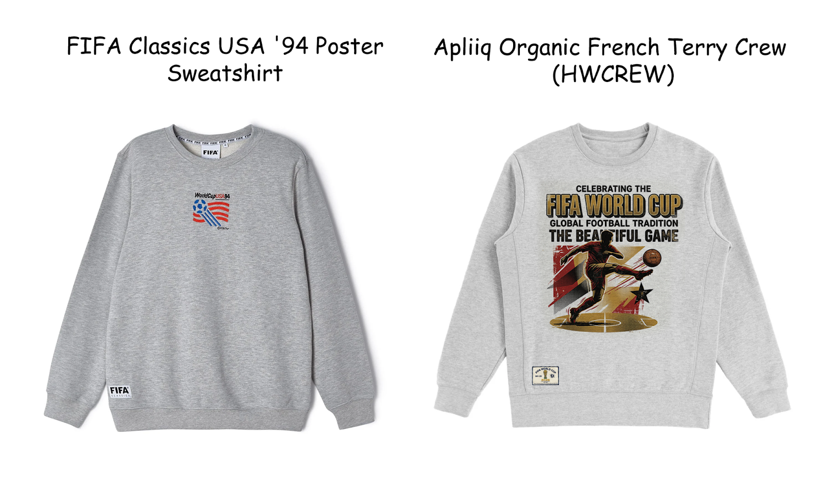
Alright, now let’s move to the sweatshirt, because this is where the strategy shifts a little. Up until now, everything felt very “current moment,” very tied to the hype of the FIFA World Cup. But this piece? This one leans into something else, nostalgia.
The front is super minimal. Small chest graphic, nothing loud, nothing competing for attention. If you just saw it in passing, you might not even immediately register it as FIFA merch.
But then you flip it to the back, and that’s where the play happens.
That big “World Cup 1994 USA” graphic? That’s storytelling. That’s pulling from a specific moment in time, “FIFA World Cup 1994, and turning it into something wearable. It almost feels like a vintage poster got translated onto a sweatshirt.
And this is a completely different strategy compared to the hat or the tee.
This isn’t about broad, instant appeal. This is about connection. It’s for someone who gets the reference, who appreciates the history, who wants something that feels a little more meaningful than just a logo.
From a product standpoint, they’re keeping it safe again:
- neutral grey base (easy to wear, nothing risky)
- classic crewneck fit
- front stays clean, so it’s wearable
- back carries the identity
That front/back balance is doing a lot of work. It keeps the piece versatile while still giving it depth. And again, you’ve got those subtle FIFA details, labels, and placement, all consistent with the rest of the collection.
This is one of those plays that isn’t loud, but it builds long-term value.
What’s Going On Here
- They’re using nostalgia instead of hype
- Keeping the front minimal makes it easier to wear
- The back graphic carries the story
- Neutral tones = more repeat wear
- It feels collectible, not disposable
The Miss: When It Doesn’t Land
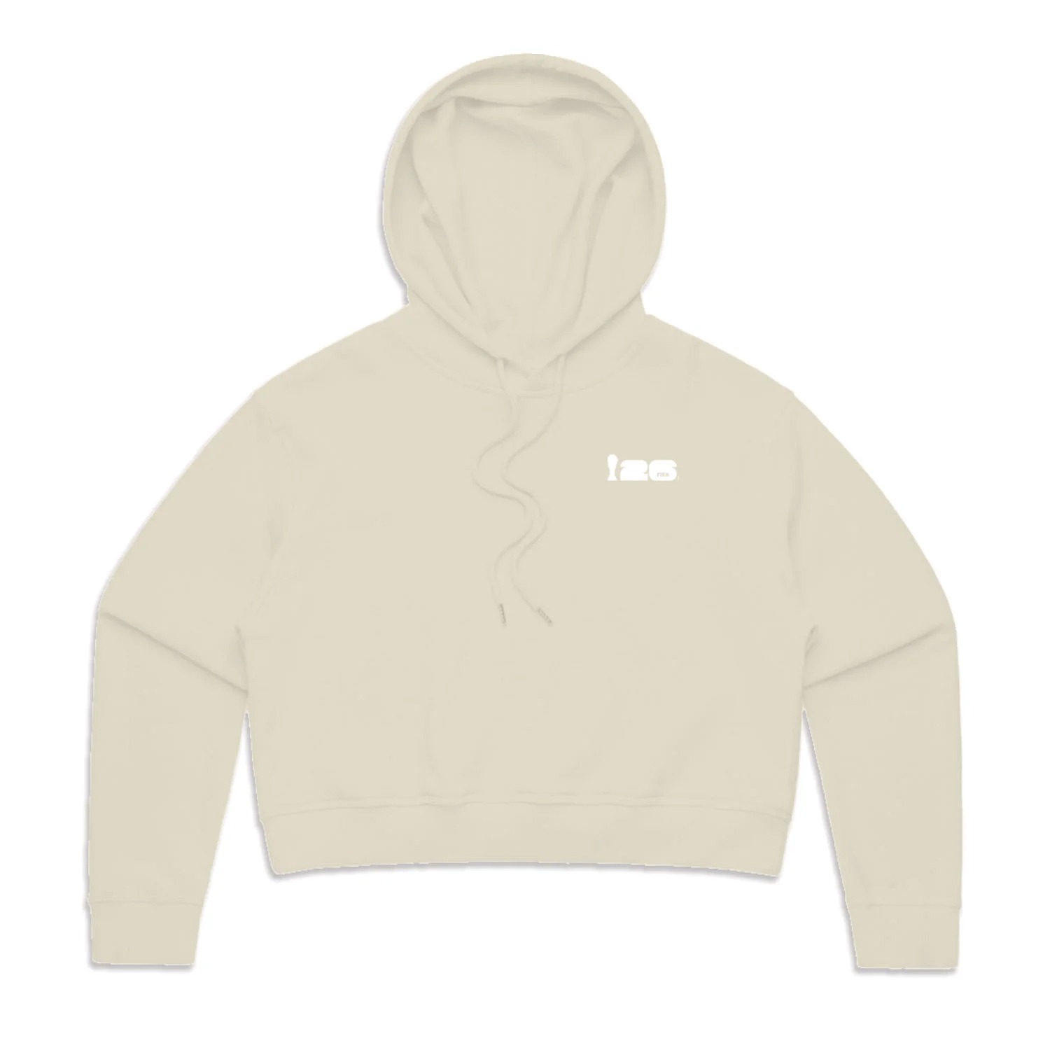
Alright, quick reality check, not everything hits. That natural hoodie? Yeah… this is where the collection kind of loses me.
It doesn’t feel connected. The branding is weak, the fit looks off, and it just doesn’t carry the same energy as the rest of the pieces. It feels like it belongs to a different lineup entirely.
And this is important. Because collections don’t usually fail because of one terrible product, they fail because of inconsistency. One piece that doesn’t align can throw off the whole story.
So yeah, this one feels like a missed play.
Final Whistle: What Are We Actually Learning Here?
So… what’s the takeaway after watching all this?
It’s not “go copy FIFA.” It’s more like, watch how they play.
They’re not overdesigning.
They’re using simple silhouettes.
They’re focusing on details – patches, labels, placement.
They’re being consistent where it matters.
And when they collaborate, it actually adds value.
That’s the difference. Think of it like studying how Vincent van Gogh or Claude Monet approached their work. You’re not trying to recreate their paintings, you’re trying to understand the thinking behind them.
Same thing here. This is a design reference. This is a strategy reference. Take what works, leave what doesn’t, and build your own version of it. Because at the end of the day, the goal isn’t to follow the playbook. It’s to understand it well enough to start calling your own plays.
Apliiq is always open to ideas. If you’re trying to bring something to life, reach out and we’ll do everything we can to make it happen.